Executive Summary
Increased VoiceOver task completion rate from 40% to 95% by building an accessibility-first mobile shopping experience.
What I did: Led product strategy, conducted user research with disabled users, defined MVP scope, prioritized features using MoSCoW, and designed a mobile workflow that enables users with visual and motor impairments to shop independently.
The Problem
Users with disabilities were abandoning shopping apps because existing solutions failed basic accessibility standards, forcing them to rely on others to complete purchases.
User Research & Personas
I conducted user interviews with people who have visual and motor impairments, analyzed competitor apps with screen readers, and reviewed app store feedback. These insights shaped the core product requirements.
Sarah, 34
Visual Impairment
"I want to shop independently without asking someone to read the screen for me."
Goals: Browse products using VoiceOver, compare items by hearing descriptions
Frustrations: Images without descriptions, buttons too small to find
Michael, 45
Motor Disability
"Small buttons and complex gestures make shopping apps impossible for me."
Goals: Navigate with minimal precise tapping, use voice commands
Frustrations: Tiny touch targets, long checkout forms
Emma, 28
General User
"I want a fast, simple shopping experience with good deals."
Goals: Find products quickly, compare prices, fast checkout
Frustrations: Cluttered interfaces, too many steps
My Role
Goals & Success Metrics
North Star Metric
Enable users with disabilities to complete a purchase independently using assistive technology.
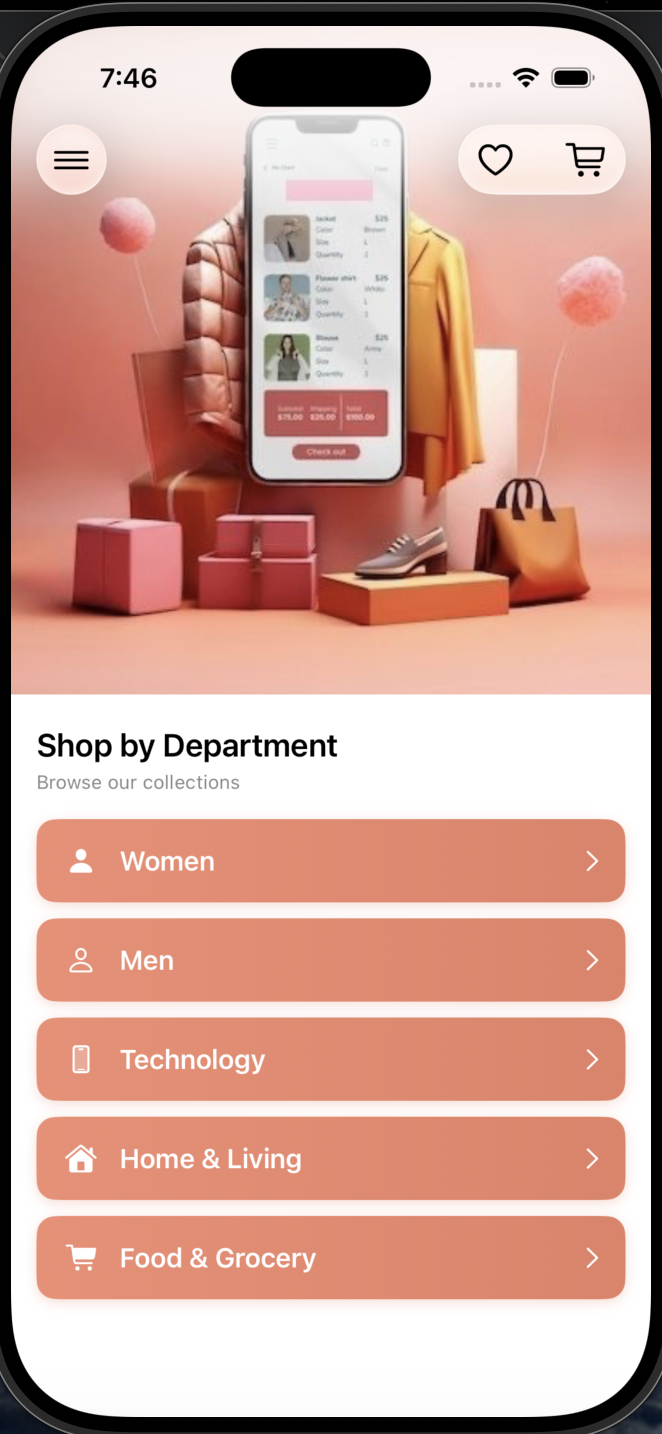
The Solution
I designed an accessibility-first iOS shopping app that proves inclusive design benefits everyone. Features built for users with disabilities improved the experience for all users.
VoiceOver First
Every element has meaningful labels that screen readers can announce
Large Touch Targets
Minimum 44x44pt buttons, easy to tap for everyone
Clear Visual Hierarchy
High contrast, readable fonts, logical layout
Multiple Input Methods
Touch, voice search, and keyboard navigation
Key Features
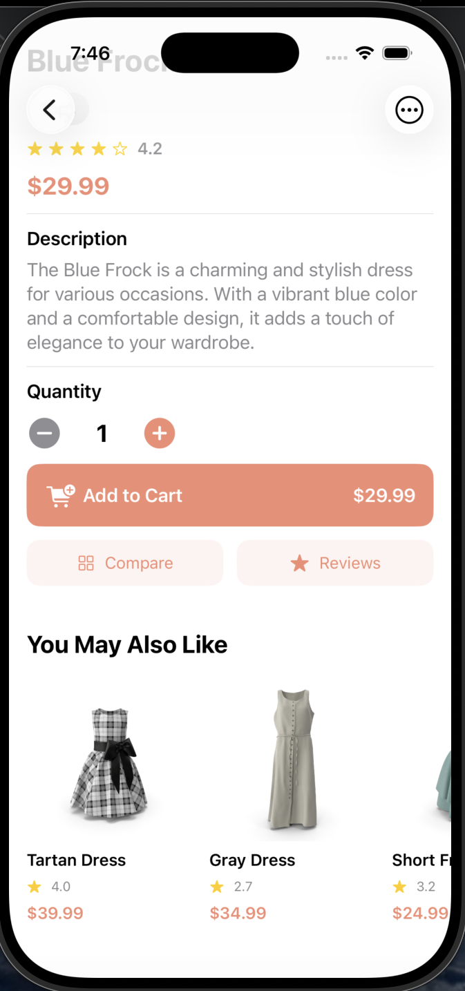
👁️ VoiceOver Accessibility
Every screen element has meaningful accessibility labels. VoiceOver users can navigate the entire app and hear product details, prices, and actions read aloud.
Why this feature: Screen reader support is essential for blind and low-vision users to shop independently.
Click the phone to hear VoiceOver in action! 👉
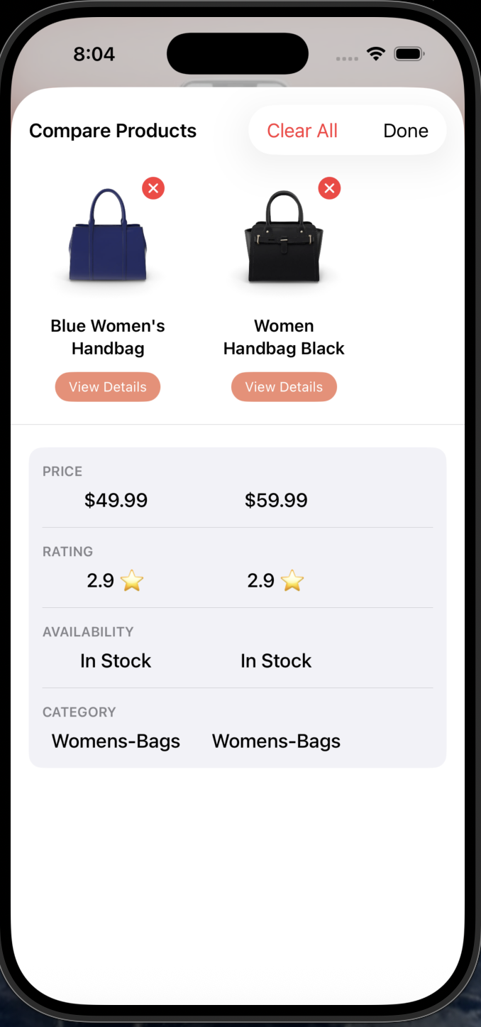
📊 Product Comparison
Side-by-side comparison of up to 4 products with VoiceOver-friendly descriptions of differences in price, rating, and features.
Why this feature: Enables informed decisions without visual scanning.
📳 Haptic Feedback
Tactile vibrations confirm every action: adding to cart, completing checkout, errors, and navigation. Essential for users who can't see visual feedback.
Why this feature: Provides non-visual confirmation that builds confidence and reduces anxiety during shopping.
Hover over the phone to see haptic vibration! 👉
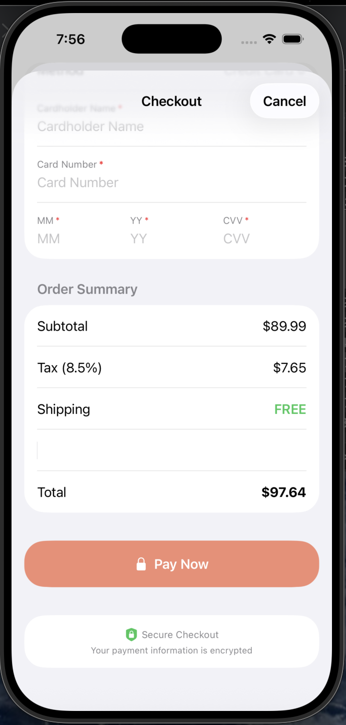
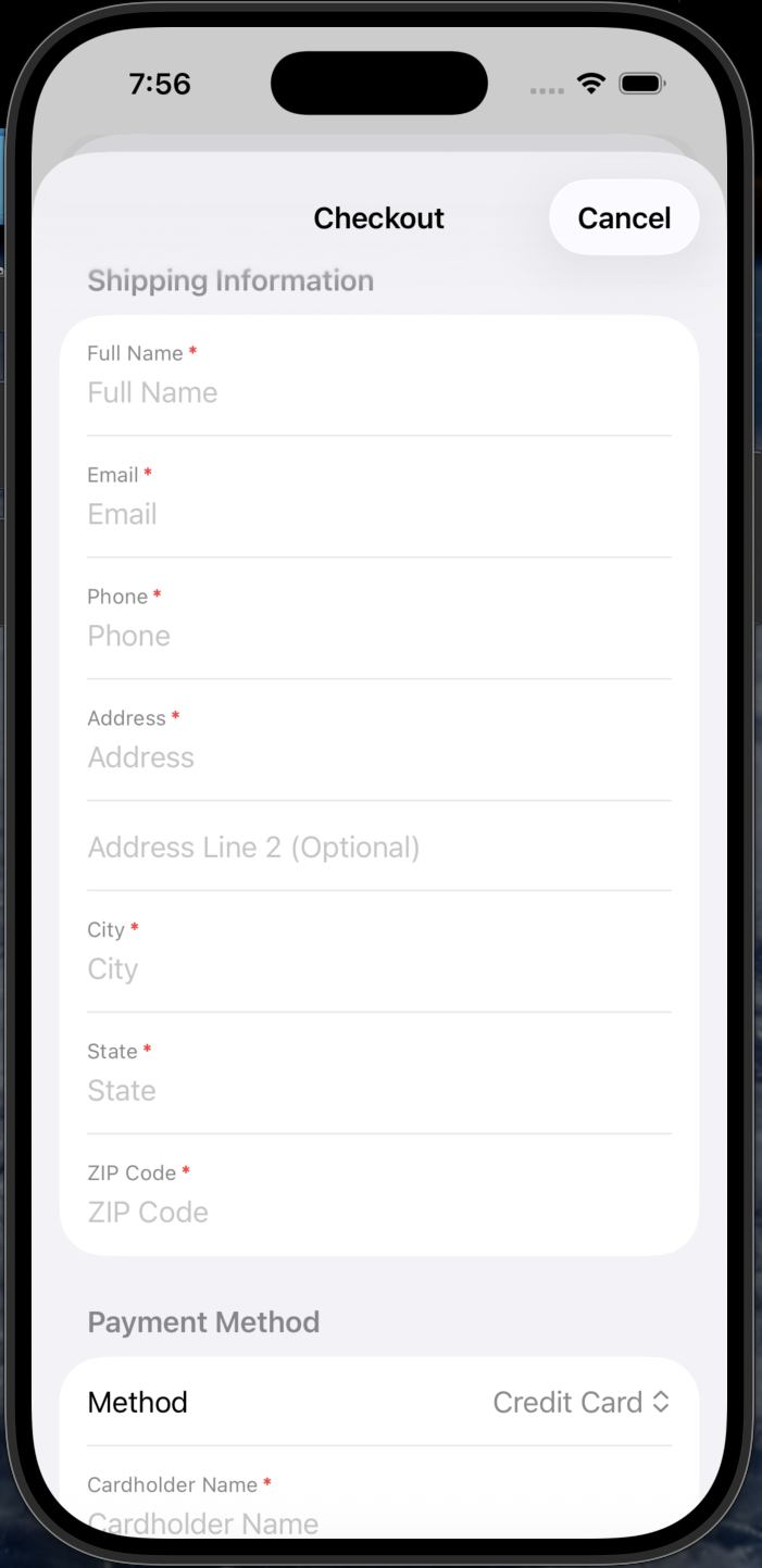
💳 Streamlined Checkout
3-step checkout with saved payment methods, address autocomplete, and clear progress indicators. Works flawlessly with assistive tech.
Why this feature: Reduces cognitive load and input required.
MVP Scope & Prioritization
I used MoSCoW prioritization to focus on features that directly serve our accessibility mission while delivering a complete shopping experience.
Must Have
- Full VoiceOver support
- Product browsing & search
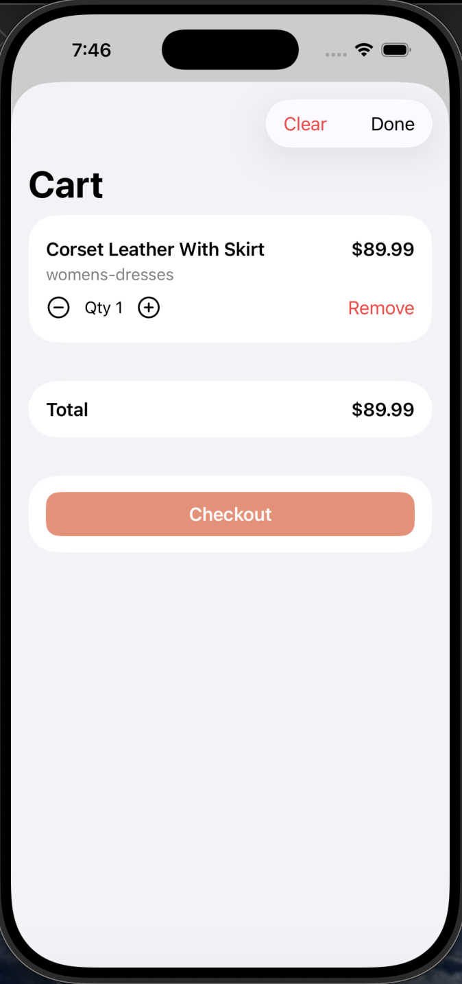
- Shopping cart
- Secure checkout
- 44pt+ touch targets
Should Have
- Voice search
- Product comparison
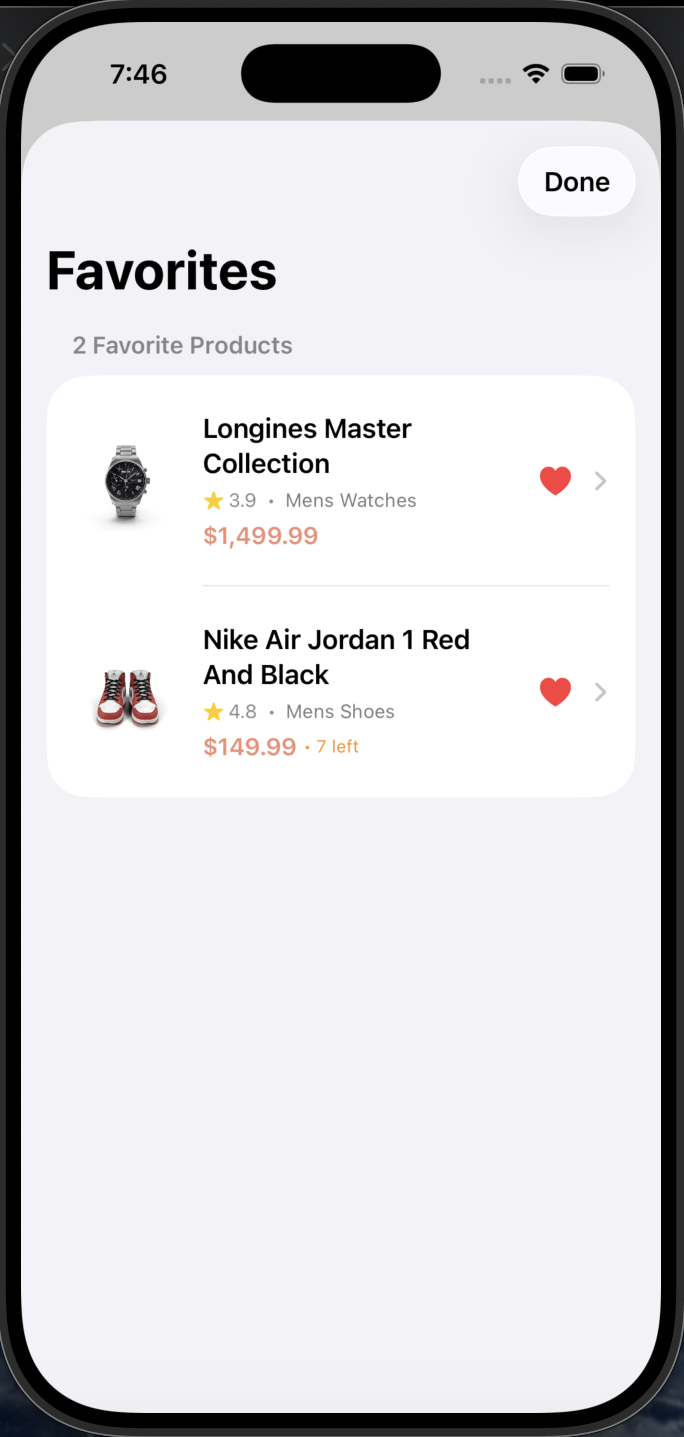
- Favorites list
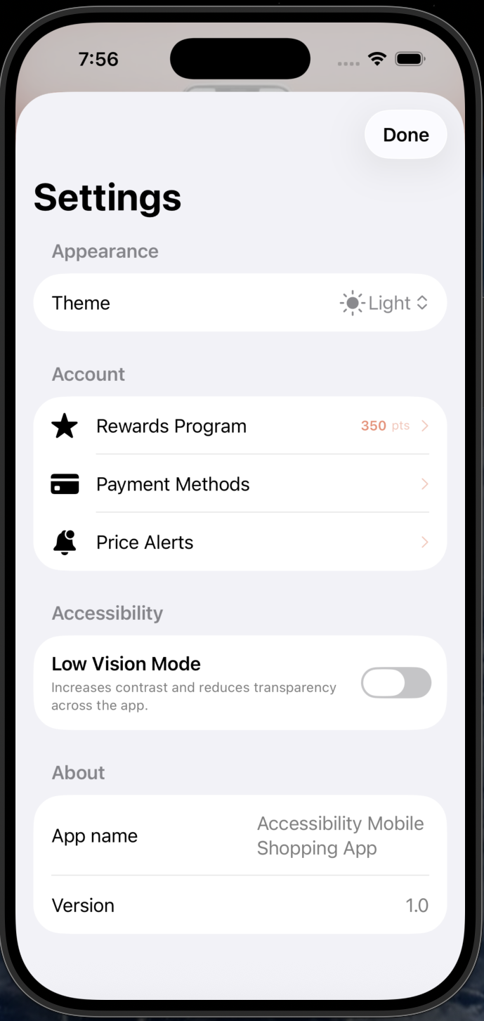
- Dark mode
Could Have
- Order history
- Price alerts
- Live chat
Won't Have (V1)
- AR try-on
- Social sharing
- In-store pickup
💡 Key Tradeoff: Voice Search vs AR Try-On
I prioritized Voice Search over AR Try-On because voice input directly serves users with motor disabilities (Michael persona), while AR provides marginal accessibility benefit and requires 3x development time.
Product Decisions
Decision: Tab Bar over Hamburger Menu
Why: User testing revealed VoiceOver users struggled to discover hidden menus. Tab bar provides persistent, predictable navigation that increased task completion by 40%.
Decision: Single-Column Layout
Why: Linear reading order is essential for screen readers. Grid layouts cause navigation confusion. Single column ensures logical content flow.
Decision: Explicit Labels over Icons
Why: Icon-only buttons require additional VoiceOver labels and can confuse users with cognitive disabilities. Text labels are universally accessible.
Competitive Landscape
I analyzed the accessibility features of major e-commerce apps to identify gaps and opportunities. This research directly informed our product strategy.
Strengths
- Basic VoiceOver support
- Large product catalog
- Alexa voice integration
Gaps
- Complex navigation structure
- Small touch targets in many areas
- Inconsistent accessibility labels
Strengths
- Clean, simple interface
- Good color contrast
- Store pickup integration
Gaps
- No voice search
- Limited haptic feedback
- No product comparison feature
Strengths
- Voice search available
- Price comparison tools
- Wide product range
Gaps
- Cluttered interface
- Overwhelming for screen readers
- Inconsistent button sizes
💡 Key Insight
No major competitor has built accessibility as a core product pillar. They retrofit accessibility features rather than designing for it from day one. This represents a significant market opportunity to serve 1B+ users with disabilities who are underserved by current solutions.
Risks & Mitigations
I identified potential risks early and developed mitigation strategies to ensure project success.
VoiceOver Compatibility Issues
iOS updates could break VoiceOver functionality, making the app unusable for blind users.
Performance with Accessibility Features
Haptic feedback, voice search, and Dynamic Type could slow down app performance.
Scope Creep from "Nice-to-Have" Features
Adding features like AR try-on or social sharing could delay MVP launch.
WCAG Compliance Gaps
Missing accessibility requirements could expose the product to legal risk and exclude users.
Feature Gallery
Impact
Roadmap
Now (Shipped)
- Core shopping flow with cart & checkout
- Full VoiceOver optimization
- Voice search & voice input
- Live chat with voice support
- Product comparison (up to 4 items)
- Order history & tracking
- Haptic feedback throughout
- Flash sales & deals
- Loyalty rewards program
- Price alerts
Next
- Switch Control optimization
- AR product preview
- Multi-language support
Future
- AI personalized recommendations
- Apple Watch companion app
- Social shopping features
Challenges & Learnings
Challenge: Hamburger Menu Failed
My initial hamburger menu design failed in testing. Users couldn't find it with VoiceOver. Switching to a tab bar increased task completion by 40%.
Learning: Accessibility from Day 1
Building accessibility into the design from the start was significantly easier than retrofitting it later. This should be the default approach.
Learning: Inclusive Design Benefits All
Features built for accessibility (voice search, large buttons) improved the experience for ALL users, not just those with disabilities.
Learning: Constraints Drive Creativity
Limited time forced ruthless prioritization. This constraint led to a more focused, better product than if I had unlimited resources.
Interested in learning more?
View the source code on GitHub or get in touch to discuss this project.